
Tara Flannery is a Certified Professional Photographer (CPP), Photographic Craftsman, and Master of Photography based in Houston, TX. Tara Flannery Photography specializes in corporate headshots. See more headshots in the gallery. Contact me to book your professional headshot today!
Table of Contents
Best Colors for Professional Headshots
Selecting the best colors for professional headshots is crucial in creating a captivating image that conveys your professional identity and personal style. With the focus on “best colors for professional headshots,” it’s important to choose hues that not only complement your skin tone but also communicate the right message. Here’s how to harness the power of color to ensure your headshot stands out for all the right reasons.
Start with a Neutral Solid Color: Choosing a neutral solid color as the foundation of your outfit ensures you don’t dominate the frame unnecessarily. Opt for timeless hues like white, cream, khaki, black, or navy blue. These colors provide a professional backdrop, allowing your personality to shine through without distraction.
Keep Color Combos Simple: When incorporating layers or additional colors, simplicity is key. Select color combinations that are visually harmonious and avoid overly complex patterns or clashes. This approach keeps the focus on you, ensuring a polished and cohesive look.
Draw Attention with Bold Shades: To ensure the viewer’s attention is drawn to your face, consider wearing bold colors near your neckline. While statement accessories can enhance your overall look, they should not divert attention from your face. Bold shades can serve as a powerful tool for drawing the eye upward and emphasizing your features.
Consider Branding: For headshots that will feature prominently in your marketing materials or on your website, it’s wise to include your brand colors subtly. This doesn’t mean dressing head-to-toe in these colors, but rather integrating small elements or accents that reflect your brand’s palette, ensuring a consistent and coherent brand image.
Understanding the Psychology of Colors
Each color carries its own energy and messaging, profoundly impacting the perception of your professional image. In the world of professional headshots, the colors you choose to wear are not just about aesthetics; they communicate subtleties of your personality, work ethic, and brand. Selecting the right color can enhance your features, set the tone of the photo, and ensure you convey the exact message you intend to your audience. Let’s delve into how each color can influence your headshot’s impact, helping you make an informed decision that aligns with your professional goals.
- White: Represents purity and innocence, offering a clean and fresh appearance.
- Black: Suggests sophistication and mystery, and is universally flattering.
- Orange: Communicates optimism, ideal for portraying a friendly and approachable image.
- Yellow: Denotes intelligence and joy, perfect for a lively and positive impression.
- Red: Signifies passion and energy, great for making a bold and confident statement.
- Green: Symbolizes growth and stability, excellent for conveying a sense of balance.
- Purple: Conveys creativity, ideal for those in creative or innovative fields.
- Pink: Projects playfulness and warmth, softening your professional image.
- Brown: Emphasizes reliability and solidity, perfect for a grounded and trustworthy appearance.
- Gold: Associates with success and luxury, adding a touch of sophistication.
- Grey: Offers a neutral backdrop, ideal for a professional yet approachable look.
- Blue: Conveys trust and professionalism, perfect for establishing a calm and confident demeanor.
Choosing the best colors for your professional headshots involves strategic thinking about the message you wish to convey and how you want to be perceived. To explore more about making the best color choices for your headshots, download my free “What to Wear” guide. This guide is filled with insights and tips to navigate the complexities of dressing for success in front of the camera.
Moreover, I encourage you to book a free consultation with me. In this session, we can discuss your headshot needs in more detail, exploring how different colors can enhance your professional image and how to incorporate them effectively. Together, let’s create a headshot that not only captures your essence but also strategically showcases your professional brand.
Recent Successful Headshots
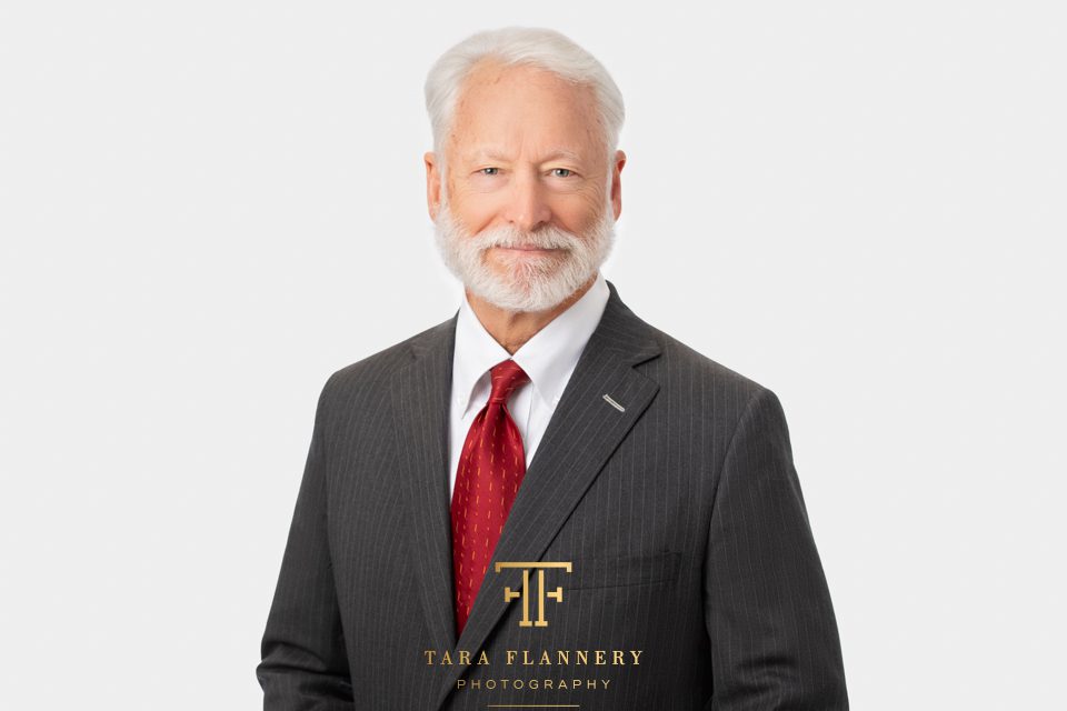
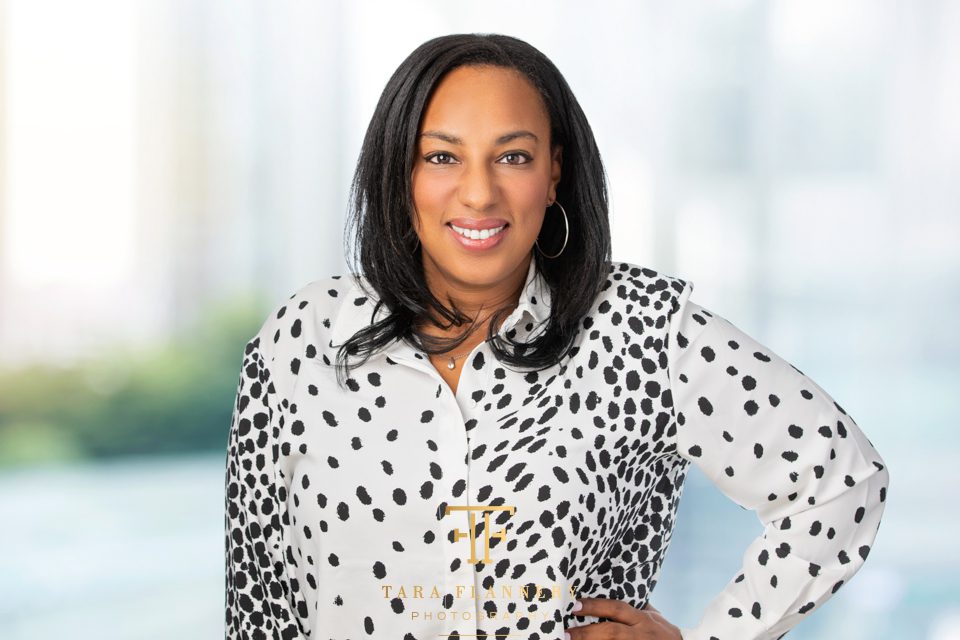
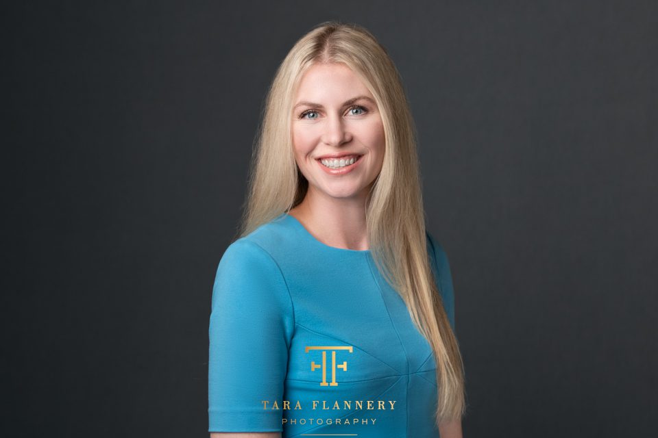
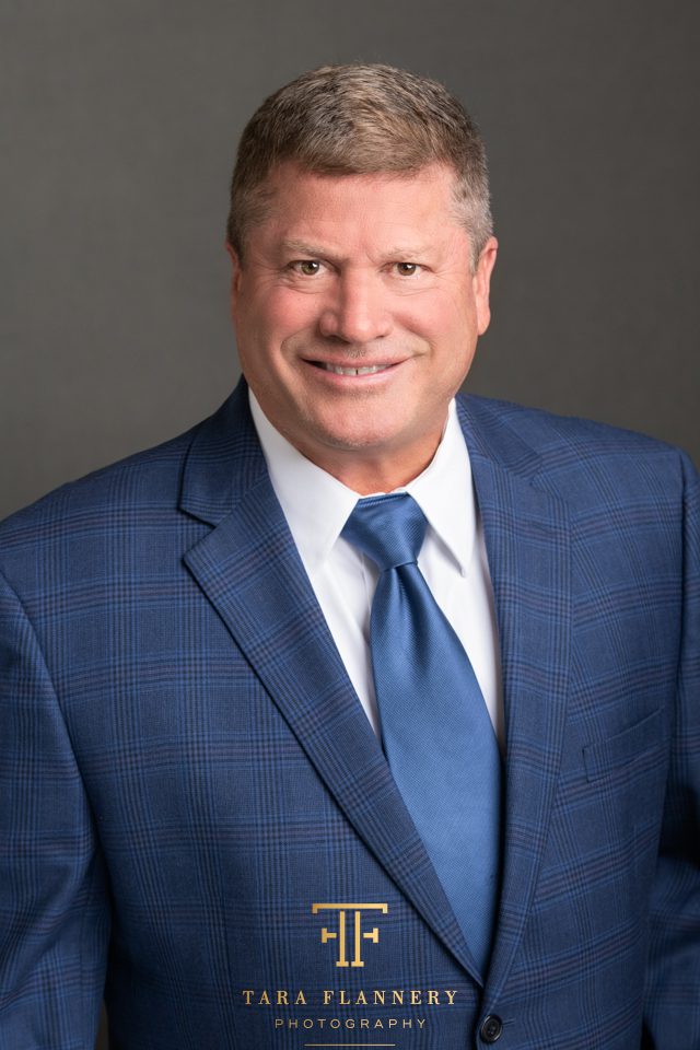
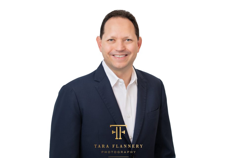
As we’ve explored the significance of color in professional headshots, it’s clear that each hue has the power to convey distinct messages and energies. Take a look at some of our more recent headshot sessions. Notice the deliberate color choices made in each headshot and their impact on the viewer’s perception. These real-world examples underscore the importance of selecting the right colors to enhance professional presence, communicate personal brand, and achieve the desired effect. Dive in to see how strategic color use can transform a good headshot into a great one.




Tara Flannery is a Certified Professional Photographer (CPP), Photographic Craftsman, and Master of Photography based in Houston, TX. Tara Flannery Photography specializes in corporate headshots. See more headshots in the gallery. Contact me to book your professional headshot today!